|
Getting your Trinity Audio player ready...
|
In today’s Digital Age, there’s a saying that equates the wealth and importance of data to that of oil. Thus, the need to make sense of the abundance of data circulating our lines becomes all the more important and urgent as well.
data
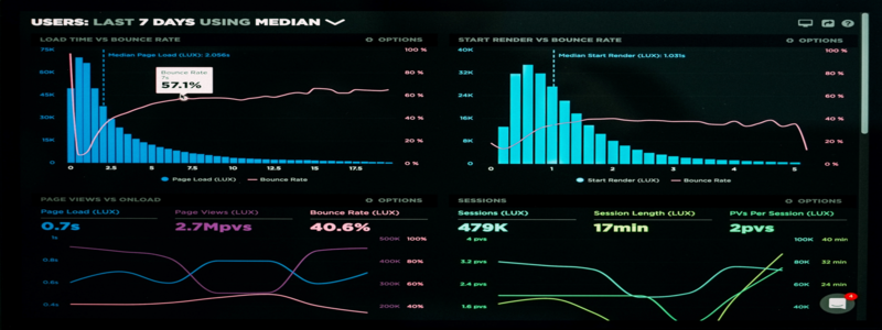
It is how we are able to translate raw data into comprehensible information that identifies patterns, trends, and anomalies. Data visualization makes us capable of creating insights from this newly organized data.
Examples of data visualization range from the classic pie charts, Venn diagrams, line and bar graphs, to the more modern heat maps and Mekko charts.
We’ve laid down the six analytical functions data visualization aids us in achieving with respective examples in the field of a simple business.
- Distribution – shows the “shape” of the data and how it is spread (e.g. can show how much of one product is being solid in one particular area)
- Comparison – shows the relationship, disparities, and similarities between parameters (e.g. can show the different sales performances of each different product)
- Change Over Time – (e.g. can show the difference in sales performance of one particular product over a specific period of time)
- Flow – shows the progression of one data point from point A to point B (e.g. can show the route of product deliveries between different logistic sites)
- Spatial – identifies patterns, correlations, and hierarchies in relation to the location of data points (e.g. can show the development of a base product and its spin-off products)
- Part-to-Whole – shows how one part affects or is dispositioned relative to the whole (e.g. can show what percentage of overall sales comes from which particular product)
Table of Contents
Why is Data Visualization Important?
To better understand why data visualization is important, beyond its wide recognition, we must take a look at its objectives. The goal of using data visualization is to adopt methods that are universal and widely effective in order to communicate and relay information in the fastest and most efficient way possible.
Every industry and business these days makes heavy use of data. It has become an integral part of an essential process called business intelligence. This is what aids managers, directors, and executives in making the right short-term, medium-term, and long-term directions to the benefit of the company, with optimal growth in mind. This is a means to concretely boost strengths, minimize weakness, seize opportunities, and eliminate threats.
At this point, it’s difficult to think of any industry that does not use or cannot benefit from data visualization. It goes without saying that science, technology, and engineering fields use this on a regular.
For example, in the world of computer science, data visualization can make for faster and more efficient bug reporting, thereby making it easier to control and mitigate risk in computer systems or networks. Supporting DevOps through data visualization has proven to be a way to streamline operations for maximum efficiency.
But data visualization is also as important for experts and professionals in the health, government, marketing, finance, education, social sciences, service, sports, and many more fields. This is because of the practical, real-life advantages brought by visualizing data. The better organizations are able to visualize their data, the more value they can extract from the consolidated information and make better, informed decisions for the future.
Example: 1854 Broad Street Cholera Outbreak Map
To give a historic example of one of data visualization’s greatest successes, let’s take a look at the 1854 Broad Street Cholera Outbreak Map created by John Snow. It basically made use of simple, small bar graphs per city block to know the number of deaths by cholera at each household in a particular neighborhood in London. The visualization’s aim was to know where the concentration of deaths is and why there is a trend in specific areas.
The visualization found that the city blocks that recorded most deaths by cholera had households that were all using the same well to get their supply of drinking water. This ultimately identified one of the main sources of the disease, which was contaminated water well, and aided city officials to control the outbreak by studying the contaminated water and surveying other wells.
Information in the time of Big Data
Today’s Digital Age also heralds in the era of big data. Imagine having a spreadsheet with millions of fields, columns, and rows. This is how much data is being utilized by your average business today. Thus, data visualization becomes an increasingly crucial tool if we want to maximize all this data at our fingertips.
Good data visualization is able to tell stories that are easily understood by key people. Much like the historic example of the 1854 cholera outbreak map, good data visualization knows the data parameters to look out for in order to produce useful information based on the objectives of the study.
It is definitely not as simple or easy as generating a graph and dumping all the information on it. Good data visualization is the right blend between form and function. The data and visuals need to have the perfect synergy in order to be most effective in their purpose. The snazziest looking graph may not be able to tell viewers anything new or useful. And the plainest chart with loads of text will only bombard the viewers’ eyes and, in effect, not provide anything new or useful all the same.
Conclusion
Finding that perfect synergy between using data and visuals paves the way for reaping all the benefits data visualization can offer an organization. It will allow for better and faster assimilation of important organizational information and will encourage the quicker generation of valuable insights that will bolster organizational growth.
And as we discussed, in the era of big data, data visualization has become an essential part of any industry in order for players to be able to make better, informed decisions in the most efficient, concrete, and historical way.


